Tagsmart
Defining the user experience and shaping a brand identity for Tagsmart, a highly secure art trading platform.
User journey diagrams | Wireframes | Visual identity
User interface style guide
Overview
Tagsmart is a start-up working to raise the level of trust in art transactions. Their online platform offers cataloging, certification, and a marketplace for artists, collectors, and galleries.
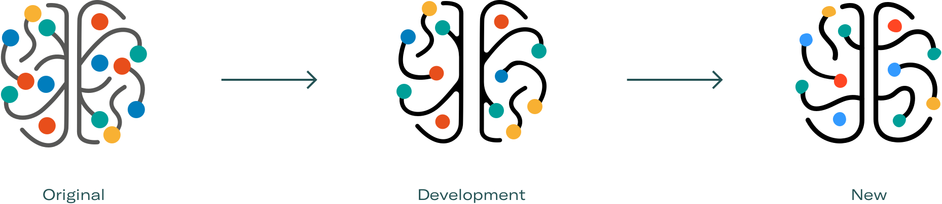
They needed to transform their overly complex platform. We did a comprehensive product review and redefined the user experience by taking into account all of its aspects from content and information architecture, to brand identity and UI.
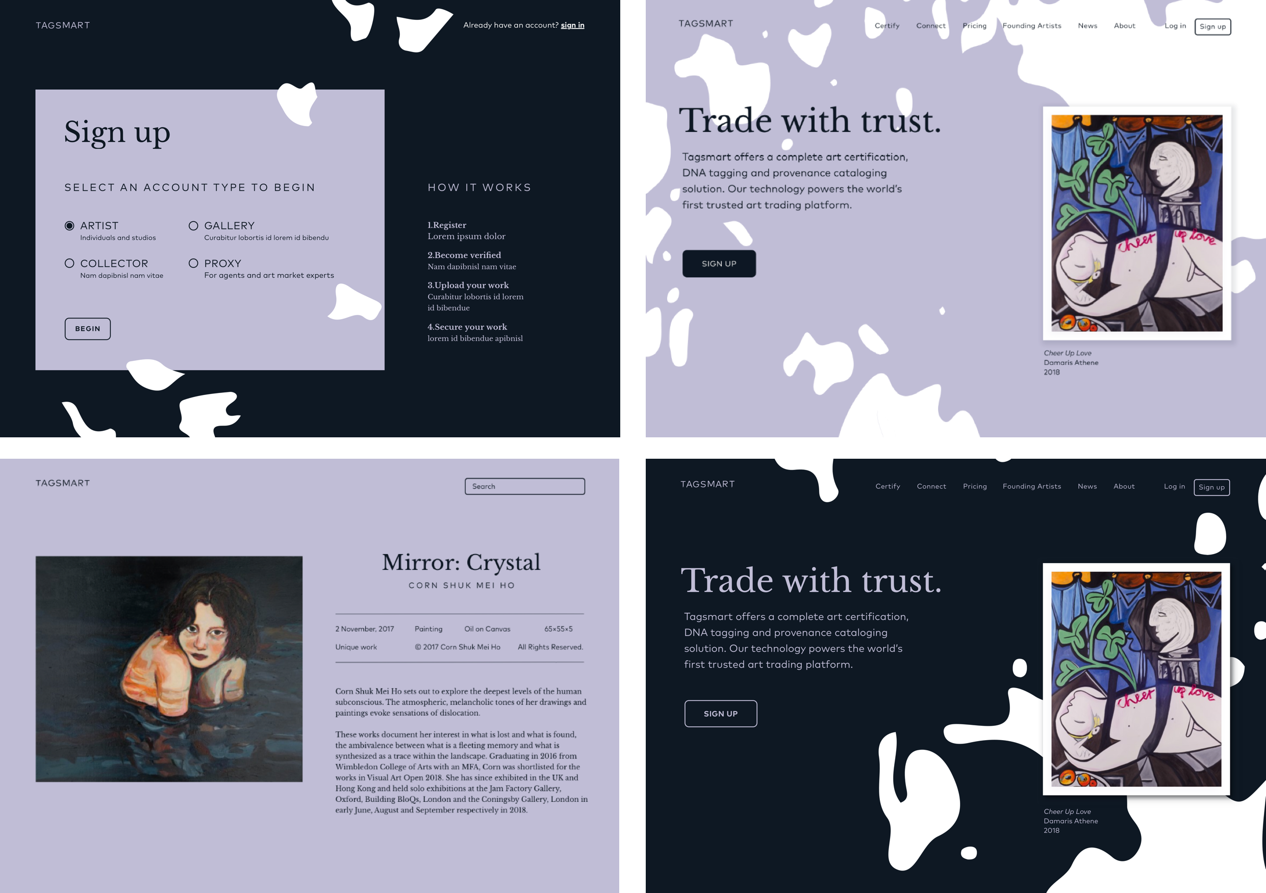
Designing a clear onboarding
Starting with interviewing the Tagsmart team, we learned that the most pressing issue was the difficulty to onboard new users.
Conducting user research focused on the onboarding process, we’ve identified 2 key stages where users were struggling to proceed and likely to drop out.
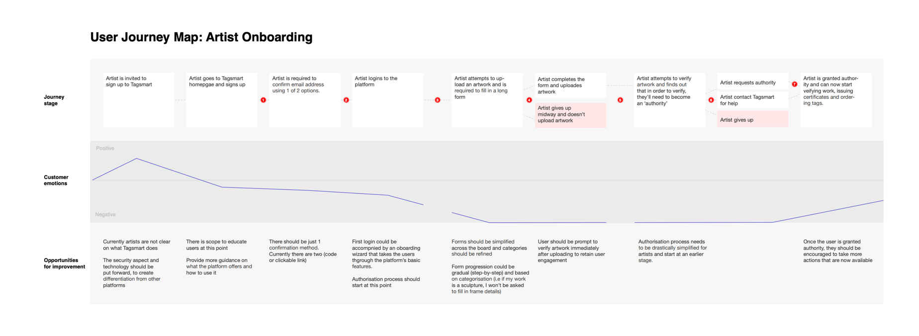
After the first login, the journey split into two tangents asking for the user’s personal data and proof of identification through the actions ‘propose new artist’, and ‘request authority’.
These tangents represent the pain points mentioned in the interviews, that were preventing users from uploading their first artwork by being obtuse in meaning and clumsily implemented.
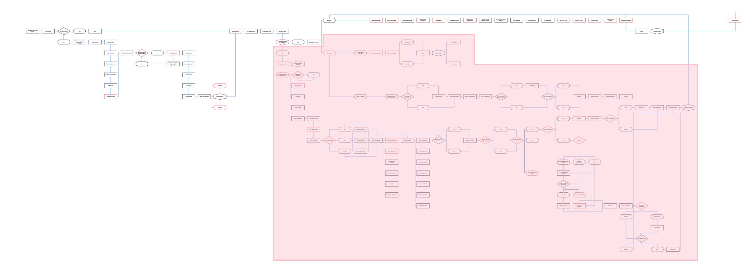
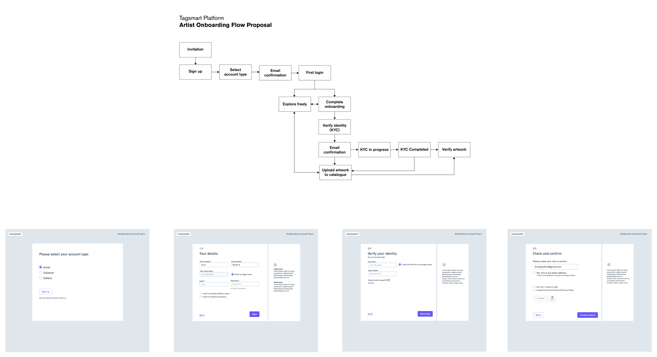
THE SOLUTION: PUTTING THINGS IN CONTEXT
The new onboarding journey incorporates these essential actions in a way that makes sense to the user through proper contextualization.
For example: instead of asking artists to ‘propose’ themselves, we do a simple identity verification. Once verified, we can automatically grant them authority and add them to the register.
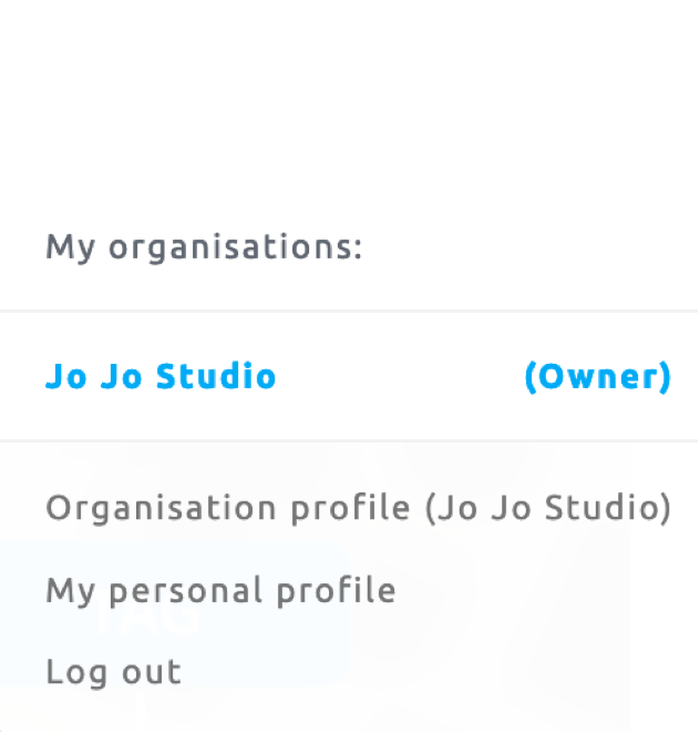
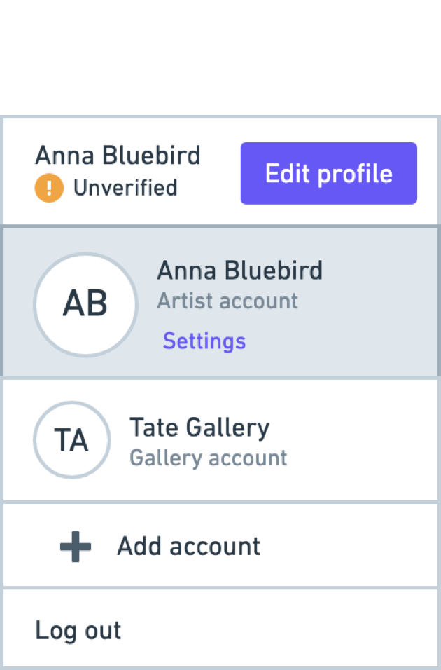
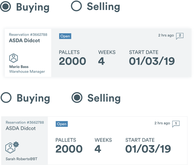
USER MENU ARCHITECTURE
Tagsmart users can have multiple accounts.
We’ve re-organized the accounts hierarchy structure, cleaning up obscure back-end terminology that was illegible to users.
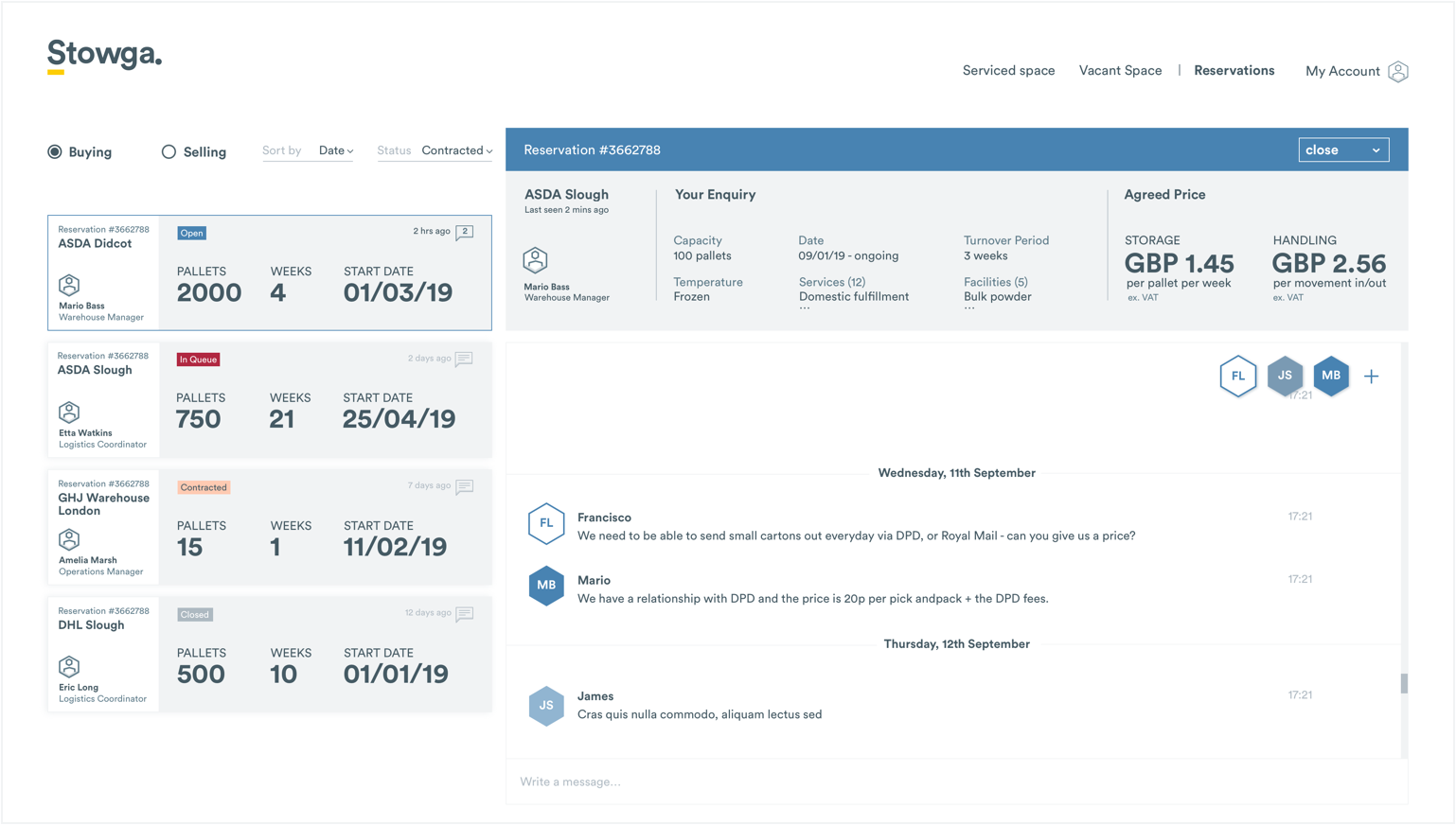
Dashboard Tabs
From the main dashboard, users can access unique features to help manage their artwork collection.
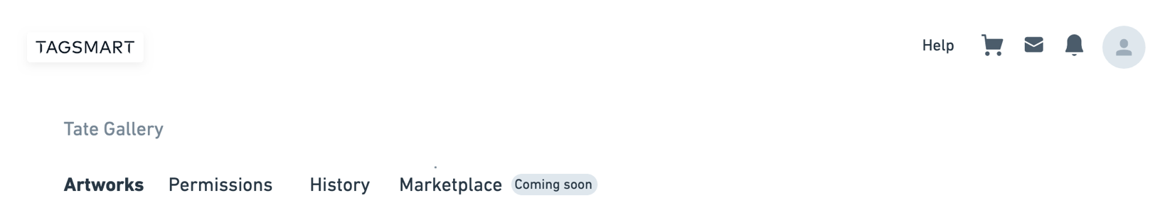
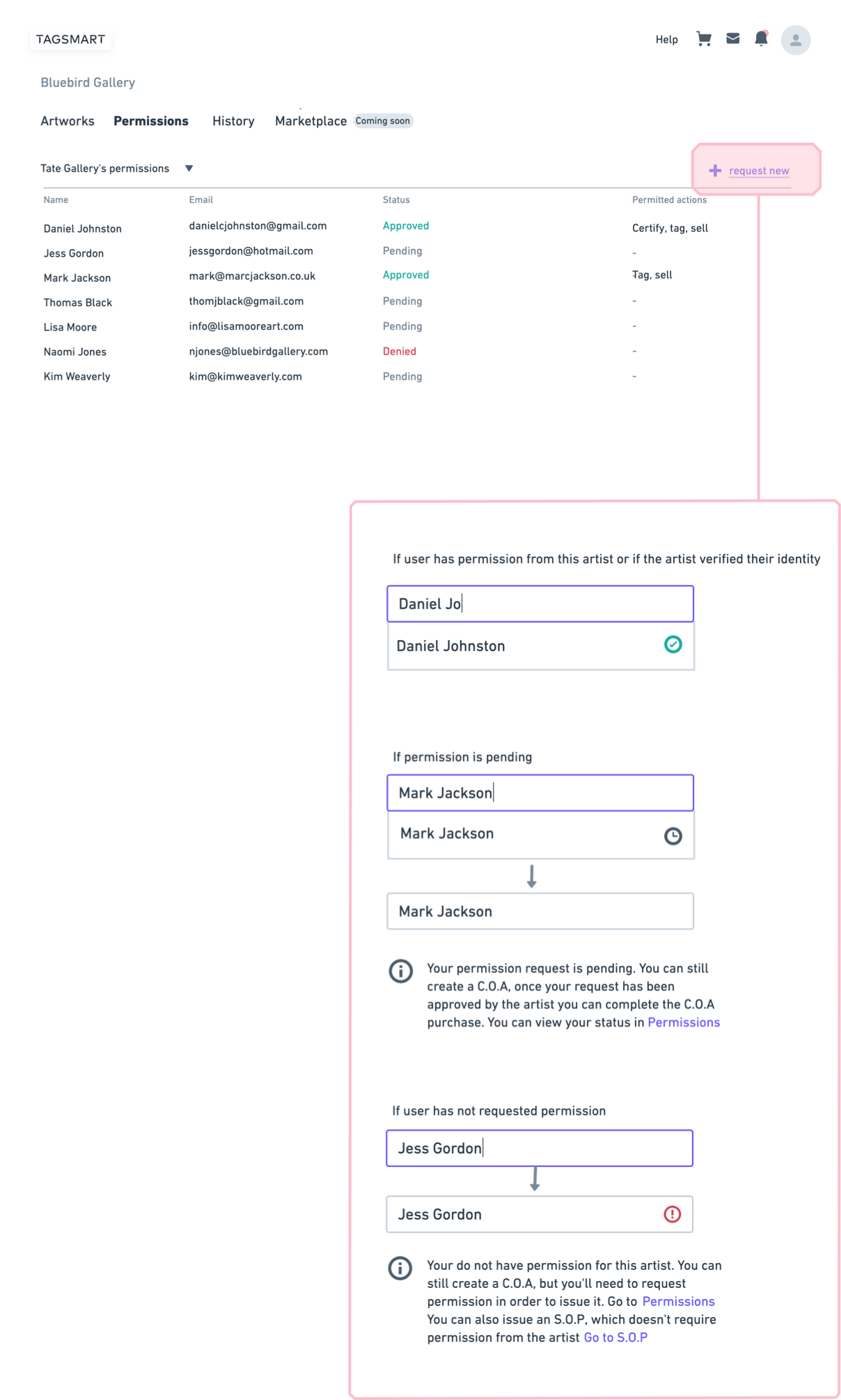
Permissions tab
This is where users can ask for permission to perform tasks on behalf of someone else. A traffic light system indicates the status of the requests.
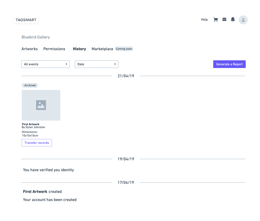
History tab
The history tab is a mini-archive that makes it easy to trace valuable transactions
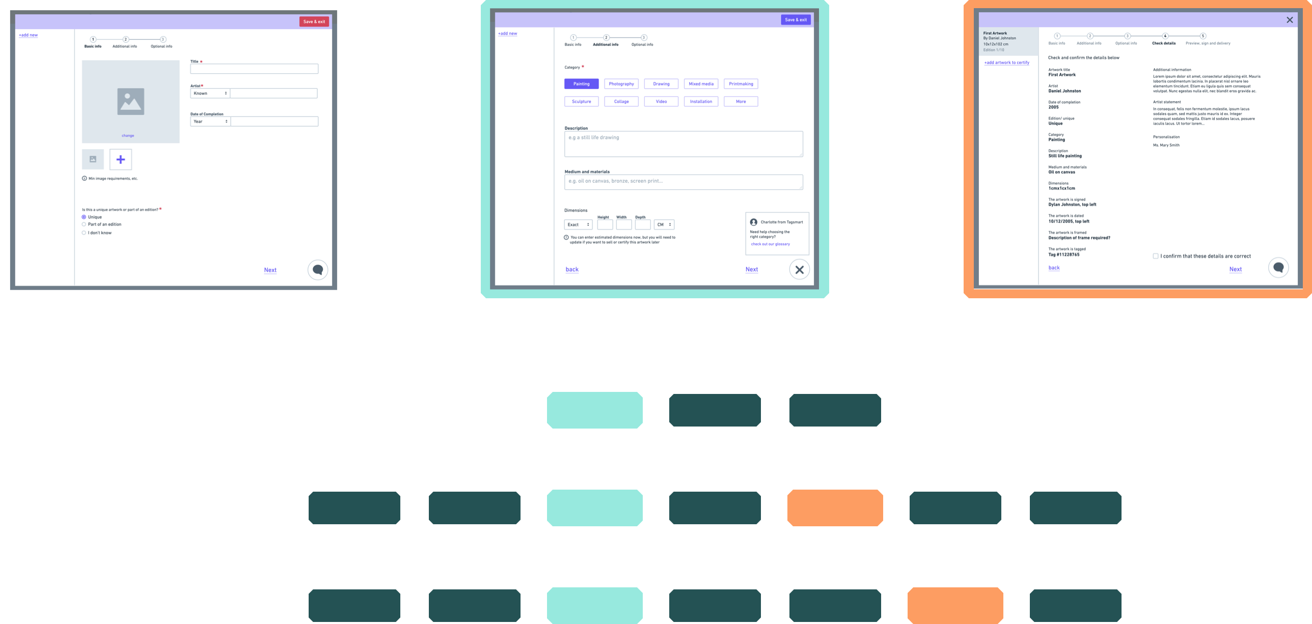
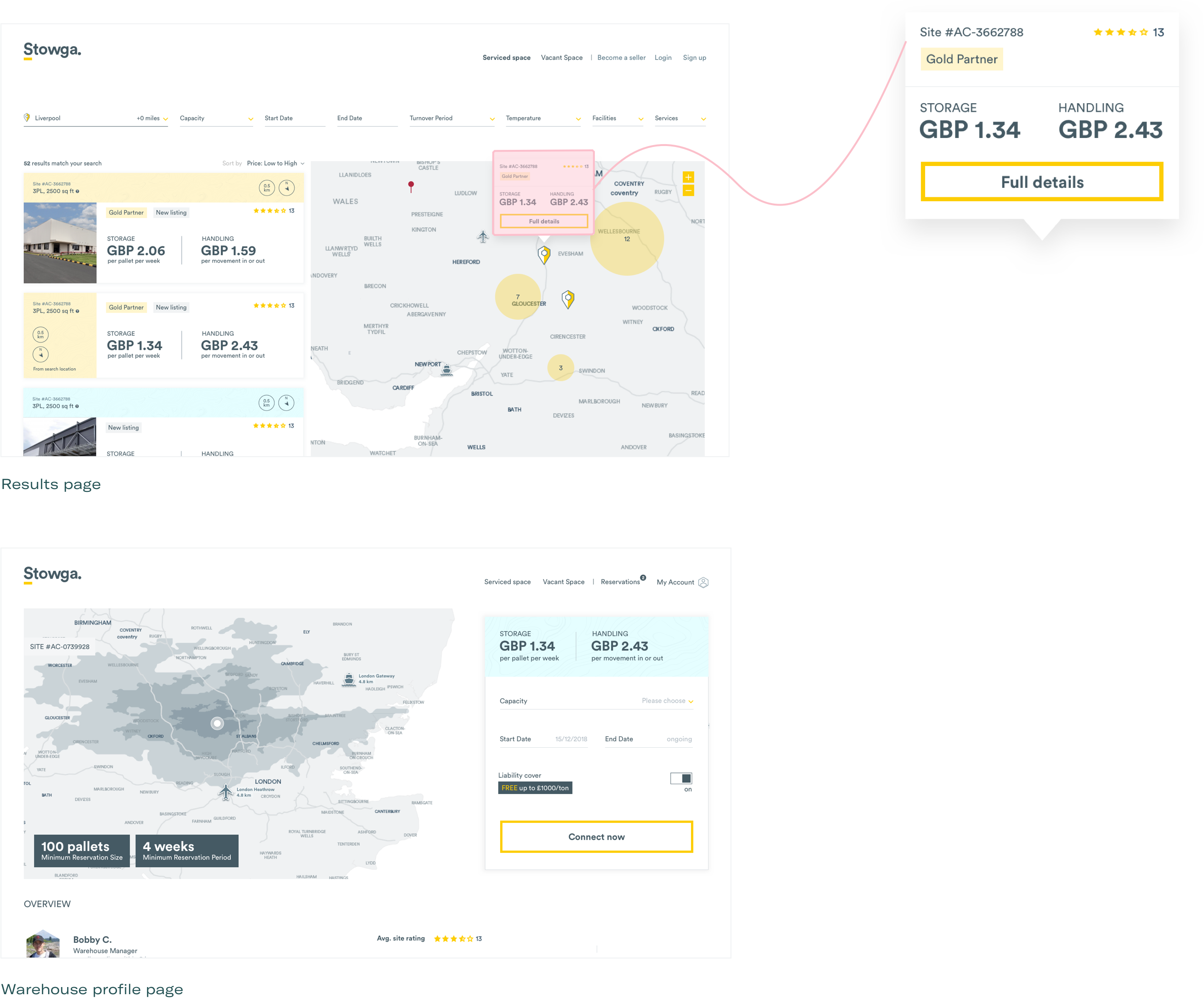
CORE FEATURES: UPLOAD, CERTIFY, SELL
Analysing the requirements of the core journey and identifying repeating data fields, to design reusable content modules.
Rebranding Trust
Although the need for rebranding was clear, the team was worried that a new branding will mean losing recognition within their existing customers.
We’ve interviewed users, asking them to describe Tagsmart in broad lines. What seemed to have gotten stuck in their memory was the company’s name and physical products, rather than any visual assets.
This was evidence that Tagsmart’s generic brand wasn’t doing anything to help their positioning. They now felt confident to go ahead with a fresh brand that represents their values.
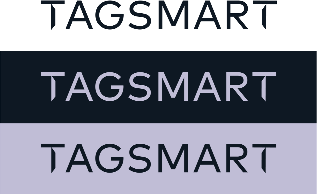
Logotype Design
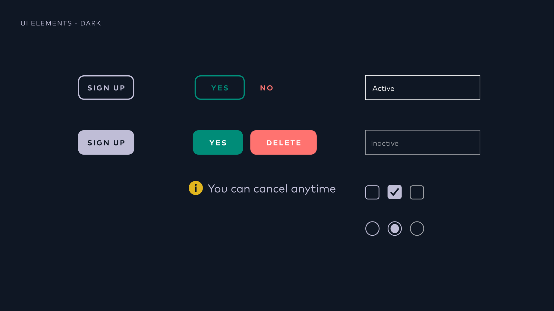
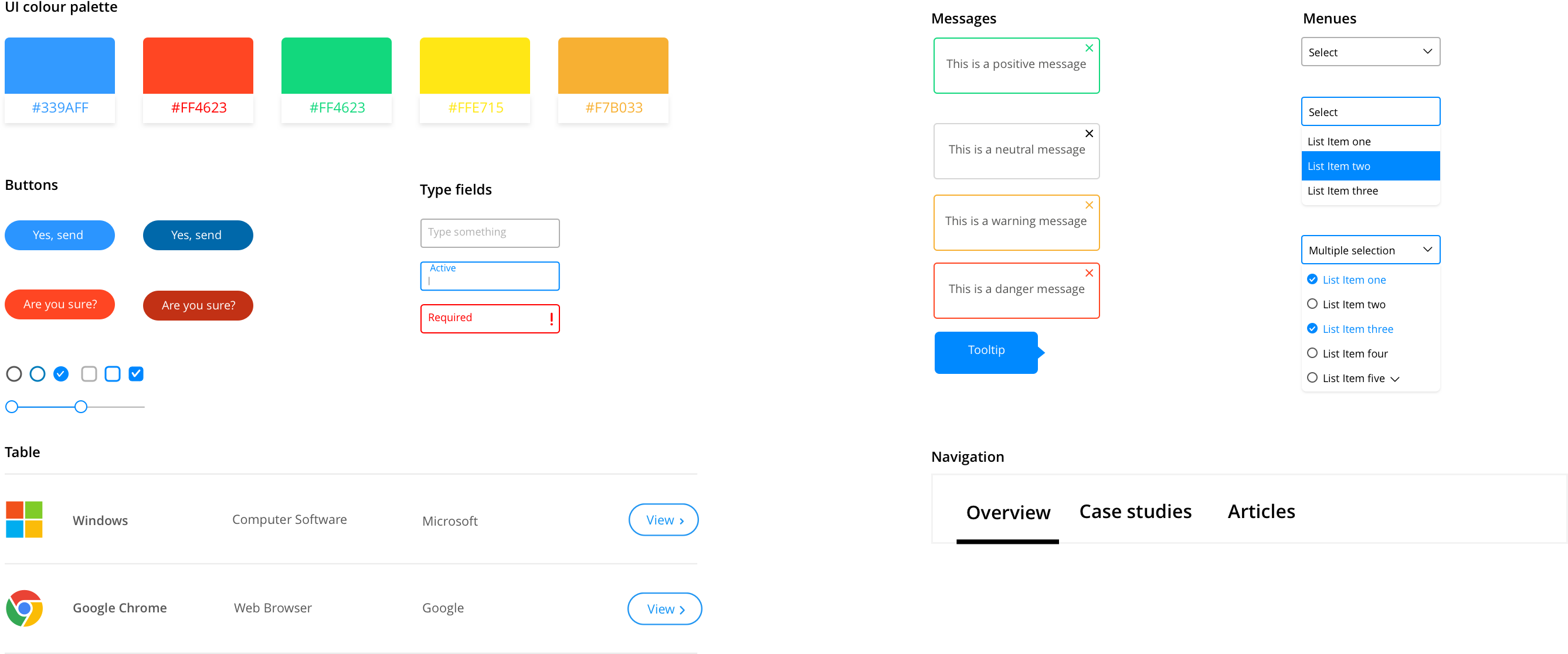
The new colour palette is based upon business values and usability principles.

Previously, Tagsmart had a bright pink as their main brand colour. This colour is problematic in UI context as it’s similar to red but can’t quite replace it.
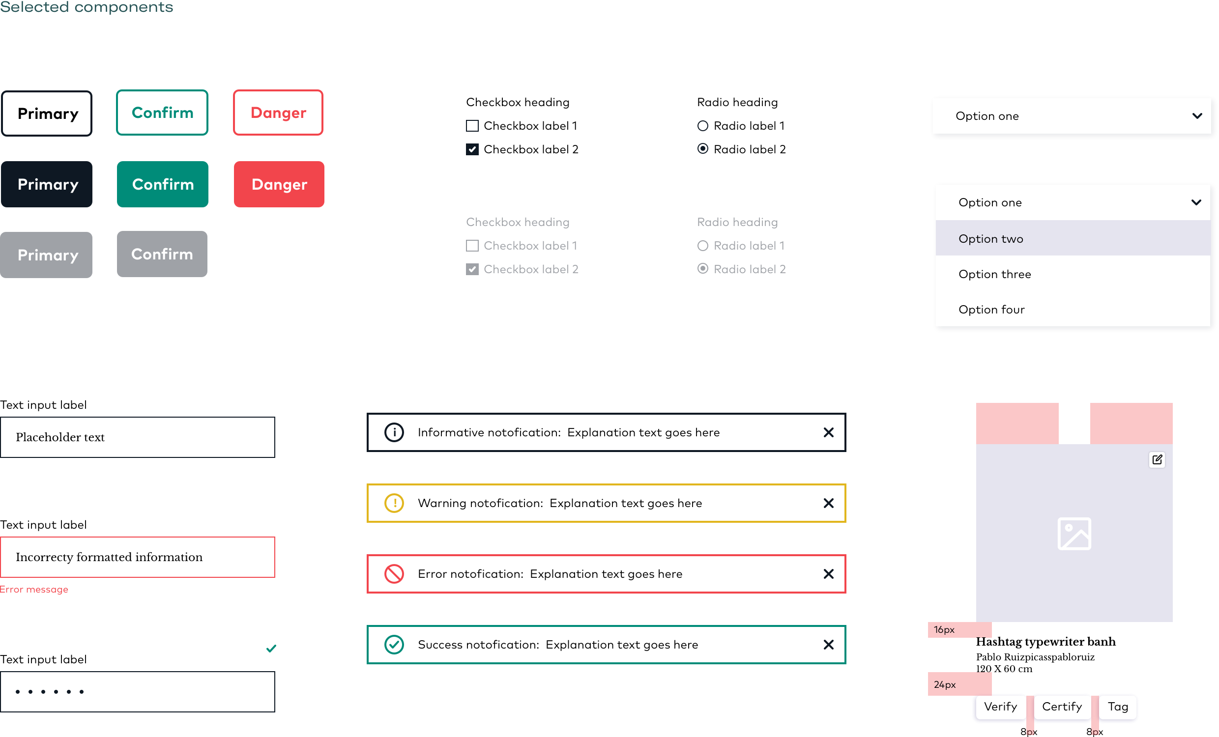
UI Foundations
A design kit outlining core design principles, for future designers and front-end developers to build upon.
UNIQUE VISUAL ASSETS
We created a process that converts artworks into graphic patterns, as a way to both feature original work by Tagsmart artists’ and produce original branding assets for Tagsmart.


