CognitionX
OVERVIEW
CognitionX had a basic brand – icon, logotype, and four colours. They have conducted some user research and defined the core requirements for the MVP.
Our brief was to design the core user journeys, establish a visual foundation, and wireframe and design the main platform areas.
to expand THE BRAND VISUAL IDENTITY,
We started by enhancing the existing assets
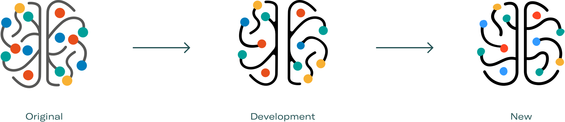
Logo evolution: creating a more organic shape by using assymetrical lines, and increasing legibility by reducing the size of the colour spots.

And developing new core assets
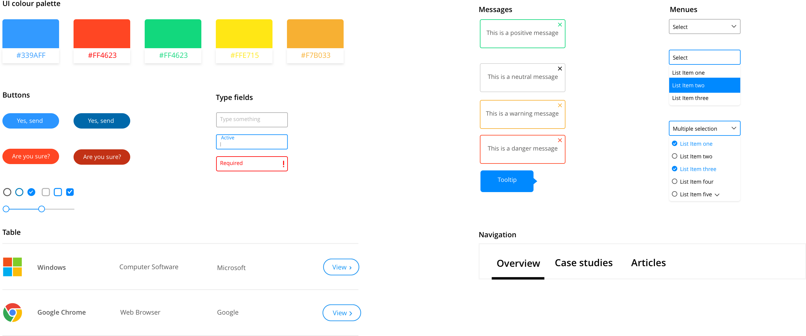
We then proceeded to create a UI style guide. Because it’s an MVP, we made it lean. Being selective about which components to design, allowed us to focus on getting the basic principles right. A precise style guide can go a long way to save time down the road.
modular item pages
The CognitionX database includes thousands of items. They are divided into types such as products, organisations, and news.
Each item on CognitionX has its own Item Page.
The item pages are the core of the platform.
Different item types have different kinds of data. For example, an organisation page can display a video and a news page has links to related articles.
So how do we design an item page that works for all item types?
Instead of designing a unique page for each item type, we created a system of building blocks. Most item types have some common data sets, so first we identified those. Then we established a set of principles such as font sizes, spacing, and positioning.
This system ensures consistency and makes it easier for users to locate relevant information.
encouraging exploration
The next thing to think about was how we can encourage exploration on the platform. CognitionX offers a uniquely deep search experience, and we don’t want users to miss out on that.
Interesting outcome of rich data is that it’s possible to find endless connections between items. Making these connections visible can provide a much more engaging experience.
By utilizing the proprietary software capabilities, we can make valuable suggestions to users.
We designed UI elements that support interconnectivity, and limit the possibility of a ‘dead-end’ search.
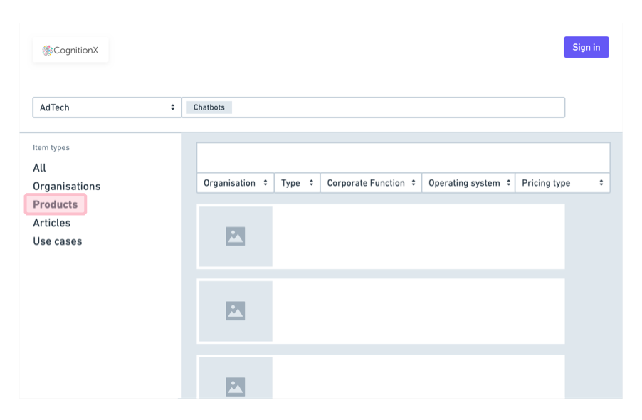
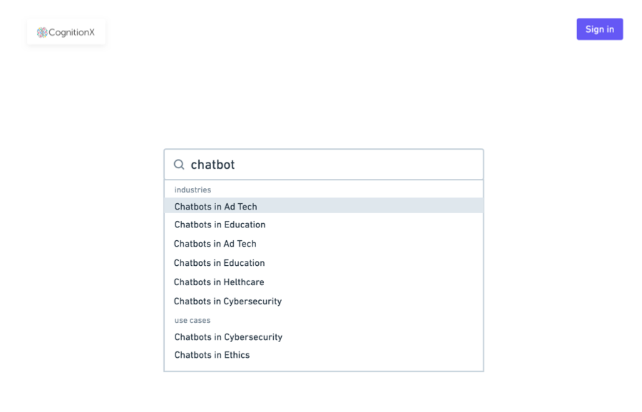
SEARCH AND FILTER RESULTS
The final MVP requirement was to lay the foundation for the search experience. The platform’s complex taxonomy presented some big challenges to designing a usable search.
We designed a search experience that provides guidance and somewhat limits choice. This enables the user to focus and not be overwhelmed by too much data.
1 Open search with toggle suggestions
2 ‘All’ selected by default
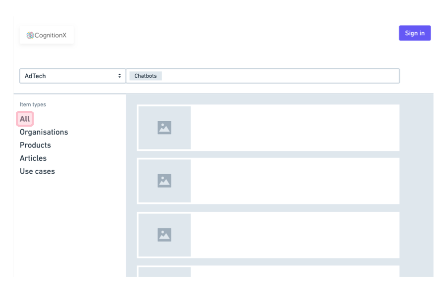
3 Selecting item type enables filters and each type has a unique set
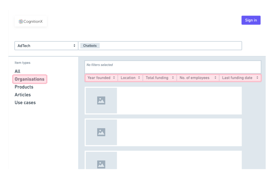
4 Add or remove filters to fine-tune the results
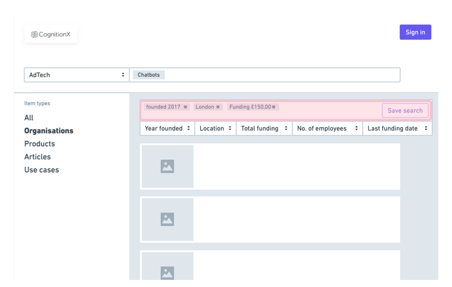
5 Selecting another item type removes existing filters