Stowga
OVERVIEW
The Stowga marketplace turns the lengthy offline process of renting warehouse space into a quick and easy interaction.
The marketplace site needed to put forward its key principles of simplicity and transparency, ensuring a wide range of audiences could interact and make deals with ease.
To achieve that, Stowga’s basic brand needed to be expanded into a comprehensive UI system.
VISUAL BUILDING BLOCKS
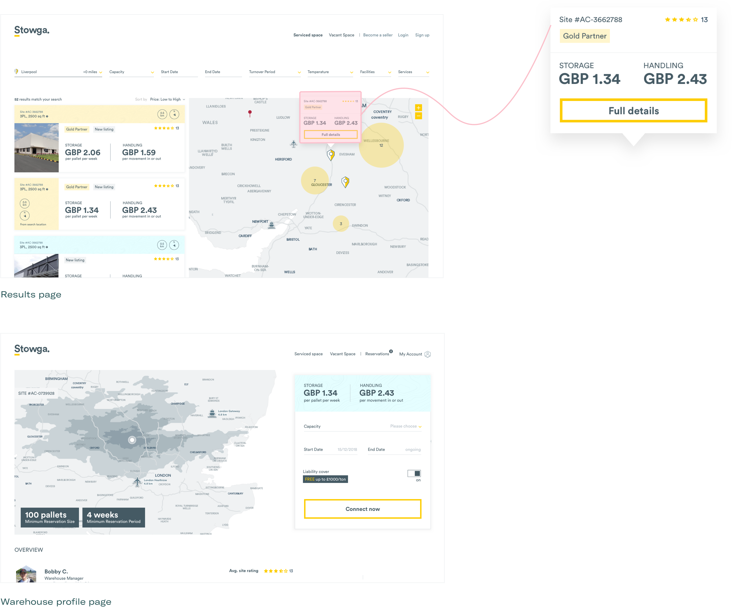
To build the Stowga UI system, we started with the main area of the marketplace where customers can search and browse warehouses. The most basic unit on this page is the pricing information, as this is the first thing customers look for.

Next are the other elements that make up the warehouse listing item.

A listing item is a modular unit. The white area is for primary info, and the colour area is for secondary information. This colour-based division is adaptable and allows size and positioning to change while maintaining consistency.

Additional basic elements

The basic building blocks adapt to create new components across different pages
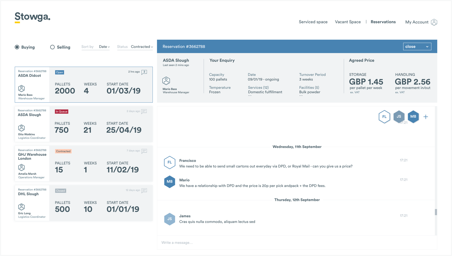
The reservation area has a similar layout to the search page but is more complex. The basic units adapt to accommodate different information while maintaining the same visual hierarchy.
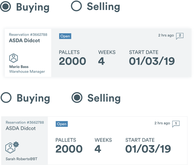
The secondary colour palette for reservation status

Customers can have reservations for both buying and selling space. The flipped colours provide a quick visual cue to which you are currently viewing.
BESPOKE MAP EXPERIENCE
Stowga knew from the start that they wanted a bespoke map. Location and local information are key factors for choosing a warehouse, so the map has to provide access to this information.
Building on the newly established principles of spaciousness and simplicity, we created a new ‘inverted map’.
The white sea ensures that the map stands out on the page, without using harsh means like bold outlines or huge fonts.
We kept going back to the research to make sure the right information stands out, while unnecessary data is hidden.
The Dark Side
Once the buyer side of the marketplace was done, we moved on to design the seller area.
This is the ‘serious’ side of the platform. Here users can put their warehouse space on offer, manage their listing and pricing. There are many details and complex features.
We used the somber Stowga blue, creating a clear distinction between the buyer and seller modes. The adaptive UI system allowed us to easily adapt components and maintain consistency.